10 examples of a landing page that converts
By Team EtchRock in All,EtchRock,Inbound Marketing

- 5 ways to boost your post-event engagement - June 22, 2017
- 7 ways to grow your email database - June 15, 2017
- 5 ways to increase slowing ticket sales - May 29, 2017
A landing page that converts
Having a landing page that converts is the perfect integration of marketing and design. But creating a high performing landing page requires more than just a fancy layout.
A/B testing, well placed call to actions and smart copy all contribute to the overall success of a landing page. As different businesses all have different aims and needs, there is no ‘one size fits all model’ for creating a landing page that converts. In this post we look at 10 landing pages and discuss what we like and don’t like about the design to give you a little inspiration.
Note: These are just our observations. We do not know the actual results of the landing pages shown, we are merely commenting on design features that we like about the pages.
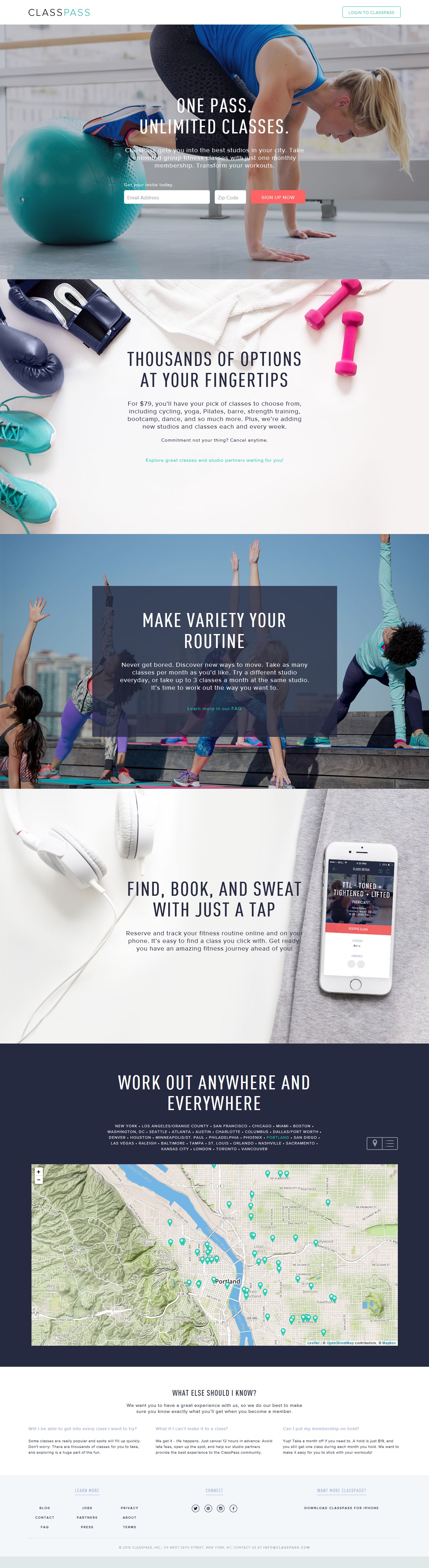
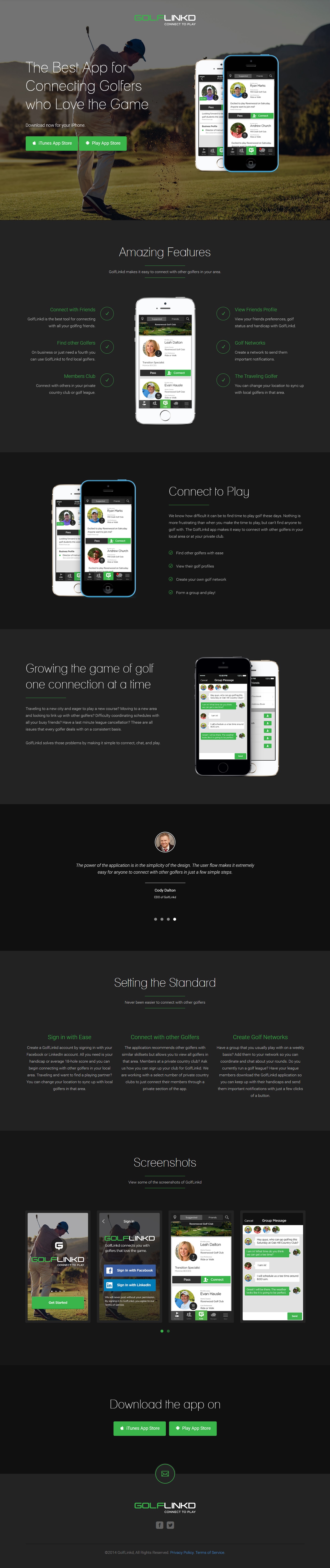
The headline is great, short and to the point. Sums up the entire offering in four words. Bold subtitles with supplementing text make it easy for the reader to distinguish ClassPass’s USP’s and make it very easy to read.
We have never been a fan of putting outbound links on a landing page, reason being is that you want all the focus to be on getting the reader to fill in the call to action. Navigation links can become a bit of a distraction. Include all the supplementary material (links) in your follow up marketing, not on your landing page. Maybe add an extra CTA at the bottom of the page as well.
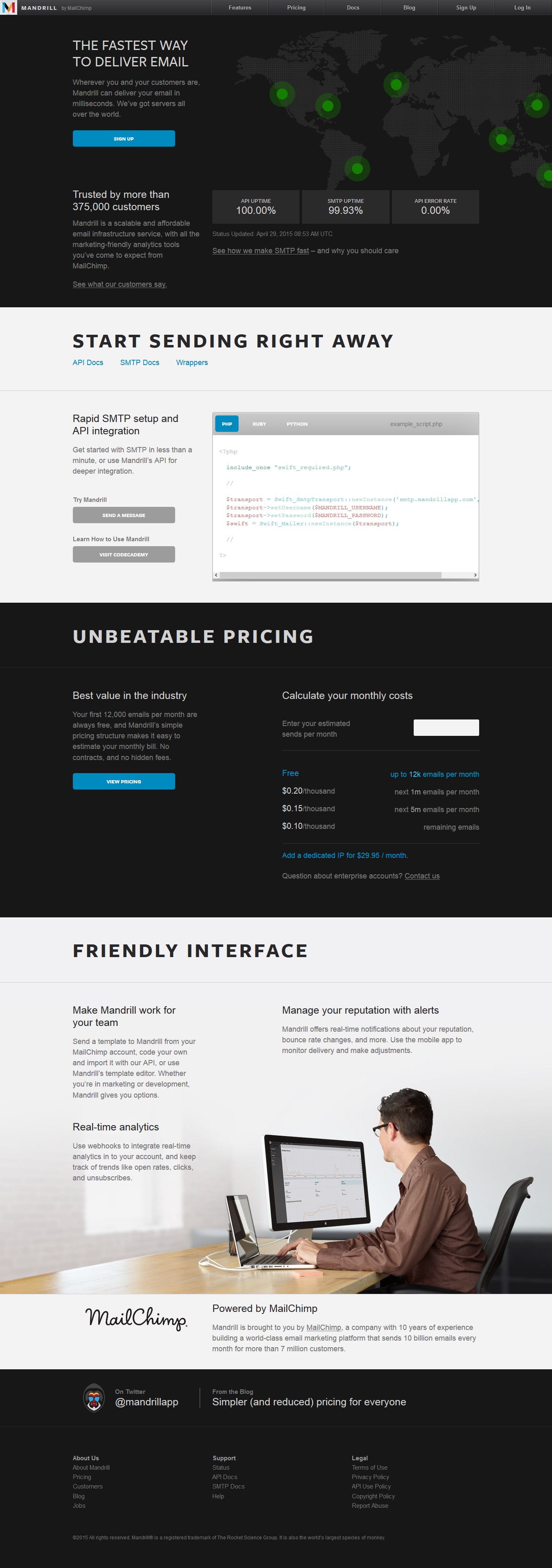
Great use of colour at the top of the page, some elements jump off the page and grab your attention. Graphics are used to support the content of copy and reinforce selling points. They offer a trial for their app which is good, with a CTA at both the top and bottom of the page.
Towards the bottom of the page, the details get too small, the text decreases in size the further you get down. Sometimes less is more.
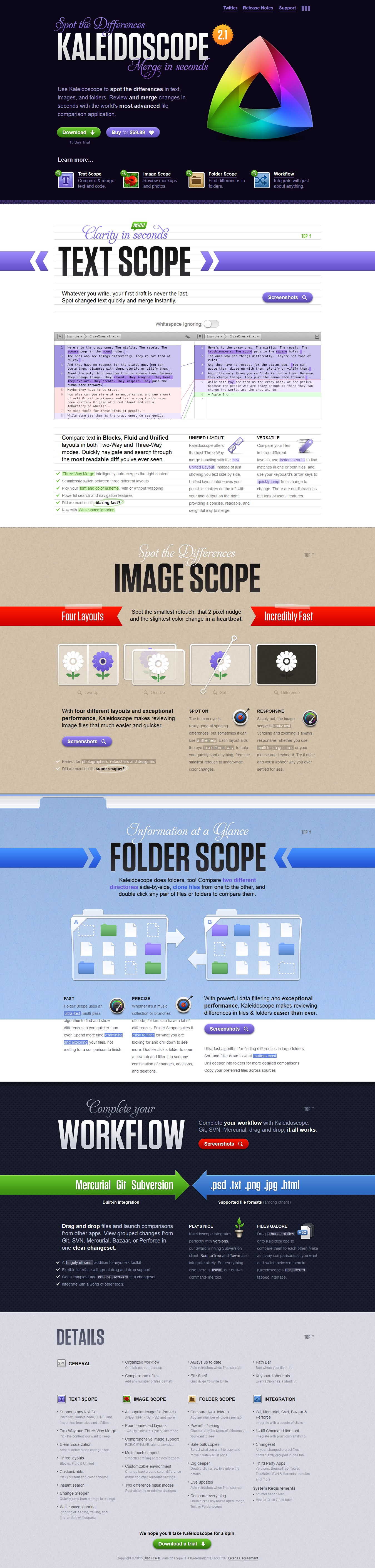
Another example of a free trial which is a great way to get a landing page that converts. They detail their USP’s in the form of FAQ’s which is a interesting take. People love testimonials and should be included where possible.
Only issue is that there are too many outbound links.
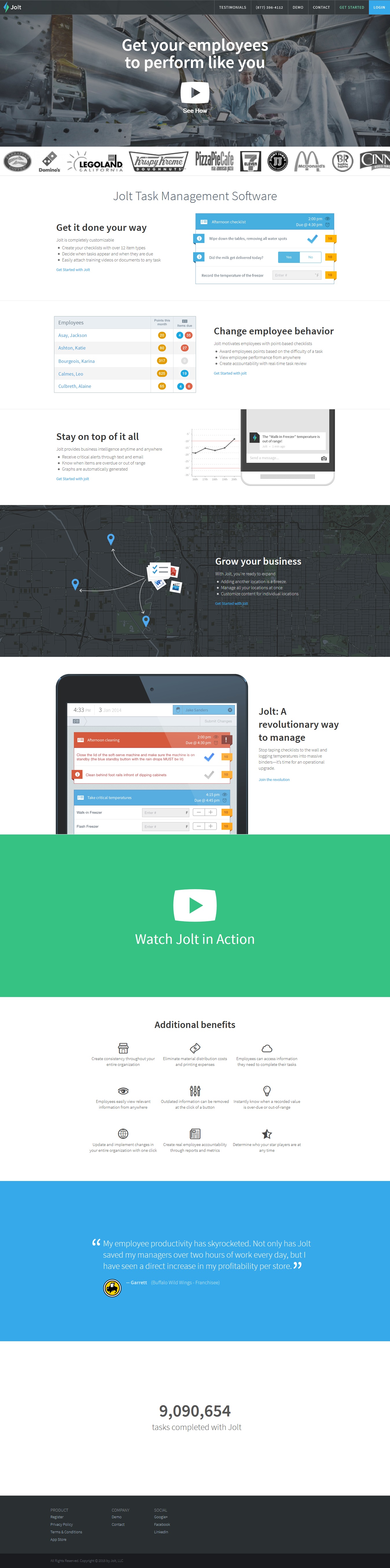
Kicks off straight away with video which can get you great results. Jut underneath the video they have a list of blue-chip companies that anyone would recognise as a form of testimonial for who has used their product. Images used are to back up the content of the copy which does a great job of selling Jolt.
No call to action! You need to capture people’s data or else the page has little purpose. I would also say the headline could be re-worked, although I understand what they are trying to achieve with it, it could be more ‘product focused’.
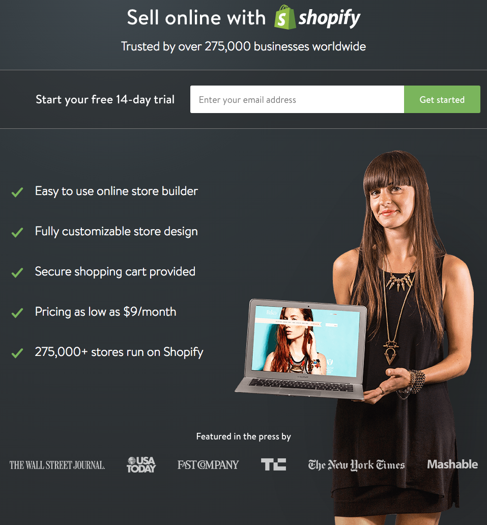
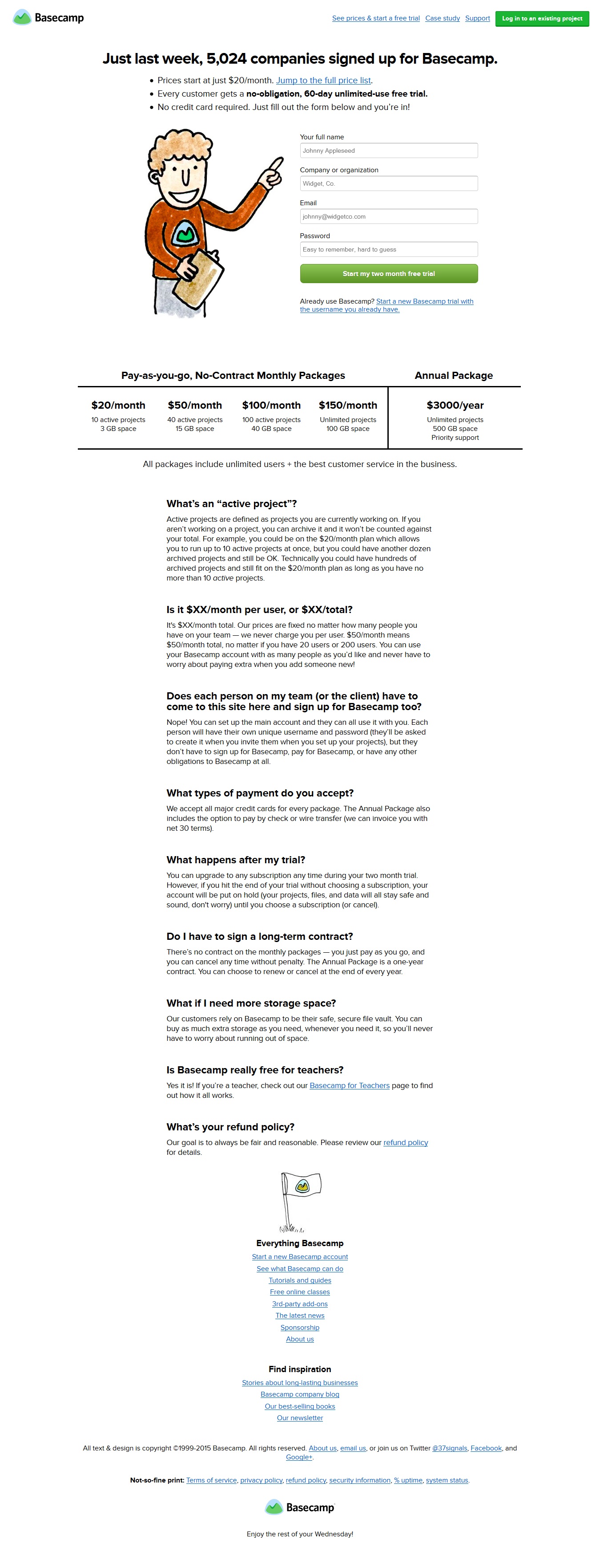
To me, this short and sweet landing page hits all the right points. Good headline, bold CTA, list of USP’s and the fact that over 275,000 people in a similar situation already use their service. If there was one criticism, it would be that it could be fleshed out a little.
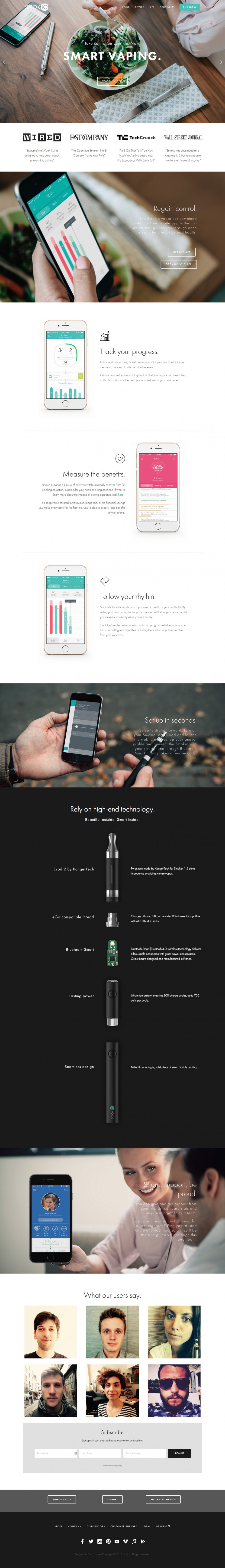
Top of the page looks great, eye catching headline with the use of video. Testimonials from big name publications give the message more clout and the copy is written and broken down very well.
Call to action could stand out more, I had to search for it after reading the page. Also questionable choice of image at the top of the page, I can see the product in it but the focus seems to be more on the food that is on the table. Product should always be front and centre of any media!
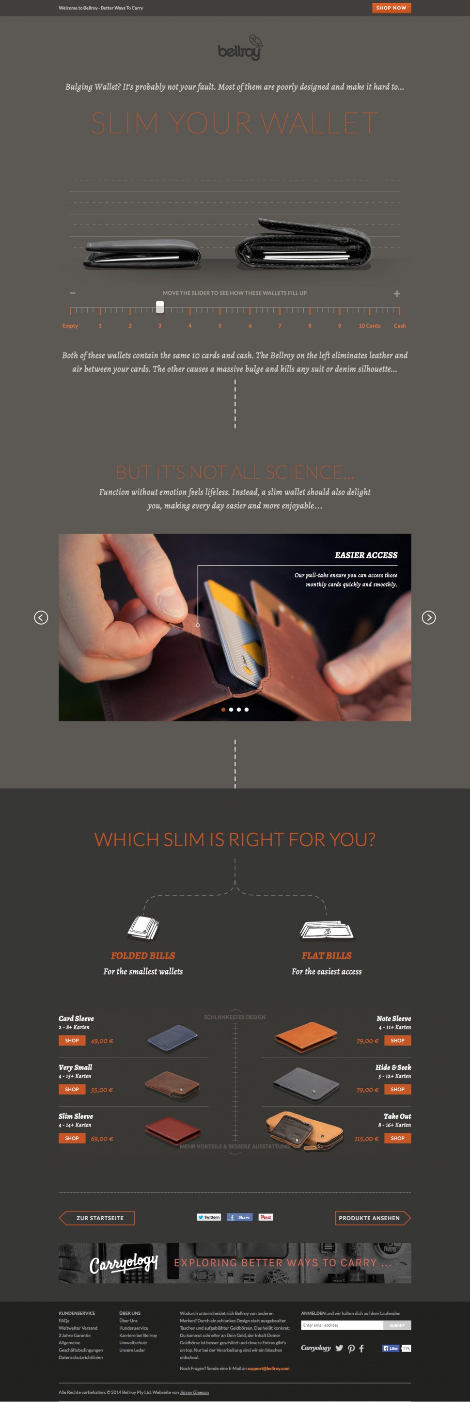
Great landing page design coupled with an interactive element where you can measure your wallet makes Bellroy’s page really work well. All the copy is designed around the concept of having a ‘slim’ wallet which is fantastic. A landing page with a perfect blend of design and functionality.
Only critique would be the use of outbound links and what appears to be an ad at the bottom of the page for a different product.
10/10
The combination of a catchy headline, CTA and customer information make you just want to sign up. Having the interactive element where you can play with their product on the landing page is also a great feature.
We hope you now have some great examples to work off when creating a landing page for your own business. The number one factor to remember when creating a landing page that converts is to speak directly to your target audience. Don’t be too broad with your copy, be direct and focus on the USP’s of your product or service. Getting your landing page in front of the right people is a whole different ball game which we will address soon!
Don’t forget to subscribe to be kept up to date with the latest event management news!


