5 critical elements for a landing page that converts
By Team EtchRock in EtchRock,Inbound Marketing

- 5 ways to boost your post-event engagement - June 22, 2017
- 7 ways to grow your email database - June 15, 2017
- 5 ways to increase slowing ticket sales - May 29, 2017
Creating a landing page that converts
The landing page is one of the most important elements of any inbound marketing campaign. Their layout, copy, design and functionality all have an impact on your ability to create conversions from visitors. If you’re spending money on PPC or social media campaigns, it’s so important that you optimize your landing pages so that you can convert as many potential customers as possible.
There is no ‘one size fits all model’ to follow when building the perfect landing page. There are, however, many different elements that the most successful landing pages include. In this post, we give you 5 elements that you can implement into your own pages to increase your conversion rate.
Get rid of external links
The navigation bar that links to other areas of your website has been the subject of discussion for a long time in regard to landing pages. The consensus in the marketing community agrees that all navigation options should be removed from all landing pages.
The reason why we want to exclude outbound links from our landing pages is simple, they are a distraction from what the page was designed to do. If we have a page built to capture someone’s data by way of a form and paid for them to reach it, why would we risk the user clicking off the page?
Whilst this may be considered best practice in the marketing community, only 16% of landing pages are free from navigation bars according to Marketing Sherpa. If you don’t want to take our word for it, the lovely people over at Hubspot did a great analysis where they A/B tested conversion rates with and without navigation menus on their landing pages. Check out their results.
Include something in your offer
If your landing page is built to capture someone’s data in a form, then you would be best advised to offer something of value to the visitor in exchange. This can be in the form of a discount on a ticket, a whitepaper or a free trial of your service.
You want your offer to be useful to the recipient and return on the promise delivered in the content of your landing page. That being said, in reality, your freebie should be moving the user further along the buying cycle towards a making a purchase.
I can see this working if I am giving away a discount or free trial, but what good does a whitepaper do in helping me to sell my product or service? Good question. Not only does industry and best practice reporting help build your status as an authority brand, you should also be writing it in such a way that it helps to move the reader further towards a purchase.
Visuals and layout
The way your landing page is laid out can have a huge impact on conversion rates. There’s a lot to think about too. Headlines, use of imagery, call to action buttons and varying forms all make up key elements that contribute to the overall success of the page.
Again, there is no size fits all model when it comes to creating a landing page. We recommend you check out our blog on 10 of the best landing page designs and get some ideas for inspiration.
The fine people over at Kissmetrics created this amazing infographic, which gives you a few ideas on how to layout your landing page.
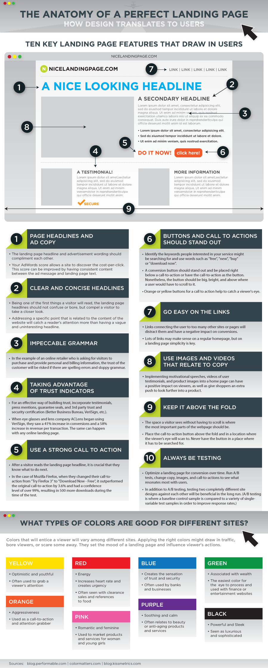
Source: Kissmetrics
Where’s the proof?
Knowing that others have used a product or service before you and achieved great results is comforting for us as humans. In marketing, we call this ‘social proof’ and are often provided in the form of a testimonial.
Testimonials are an age old method of enforcing purchasing decisions and your landing pages should be no stranger to displaying them. Groove HQ found that good testimonials increase conversions by up to 15% on websites, landing pages and email marketing campaigns.
But what makes a good testimonial? Alex from Groove HQ explains that ‘Good testimonials aren’t fluffy; they communicate very specifically the type of person the testimonial writer is and the type of problem they’ve been able to overcome. This helps readers put themselves in the storyteller’s shoes.’
Sharing is caring
Brands who don’t include social sharing options on their landing pages are potentially missing out on spreading their reach. If you are running a PPC campaign and have a paid visitor on your page, why not allow them to share it with their networks if they love your offer?
It’s simple network marketing principles, if one of your visitors shares your landing page, you have the opportunity to convert more people but for free.
As we have said many times over in this blog post, there is no ‘perfect’ blueprint to create landing pages that convert. Once you have the visuals down, the content is really going to be the main decider in whether a visitor completes the form. Make sure you know who you are talking to and tailor the content to fit their needs. Put yourself in their shoes and hit upon pain points that they potentially are experiencing, back it up with evidence, make it look pretty and you’re onto a winner!


